GalleryLab — Documentation
Lightweight image galleries for Joomla 5 & 6.
GalleryLab is a focused image gallery component that creates responsive, good-looking galleries with a built-in lightbox and flexible display options. It replaces bloated or outdated gallery extensions with a clean tool that works out of the box and stays out of your way.
Requirements
- Joomla 5.0 or later (including Joomla 6)
- PHP 8.1 or later
- MySQL 5.7+ or MariaDB 10.3+
Installation
- Download the
pkg_gallerylab-1.0.16.zippackage file. - In your Joomla admin panel, go to System > Install > Extensions.
- Upload the package file and click Upload & Install.
- The installer will set up the GalleryLab component and the shortcode content plugin.
- Navigate to Components > GalleryLab to get started.
Getting Started
Creating a Gallery
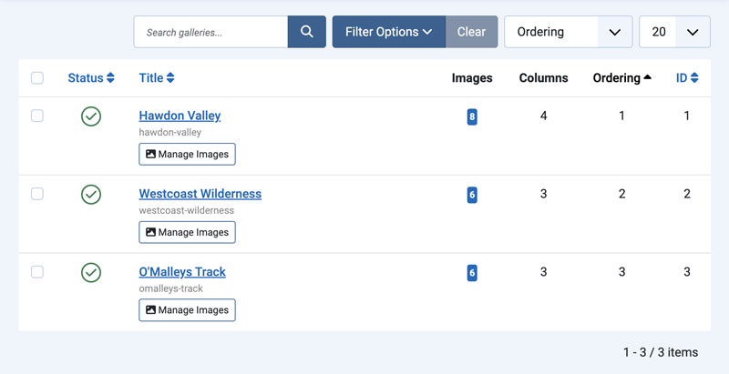
- Go to Components > GalleryLab > Galleries.
- Click New to create a gallery.
- Enter a Title (e.g. “Wedding 2026”, “Portfolio”, “Team Photos”).
- Optionally add a Description — shown above the images on the frontend.
- Set a Cover Image — displayed on the gallery listing page.
- Set the Columns count, or leave it at default to use the global setting.
- Click Save.
Adding Images
Option 1: Add individually
- Go to Components > GalleryLab > Images.
- Click New, select the gallery, upload or choose an image from the Media Manager.
- Add a Title (shown on hover), Alt Text (for accessibility), and optional Caption (shown in the lightbox).
- Click Save.
Option 2: Quick Add from a folder
- Upload your images to a folder using the Joomla Media Manager (e.g.
images/galleries/my-gallery). - In the Galleries admin, open the gallery and click Quick Add.
- Select the folder from the dropdown.
- Click Import Images — all images in the folder are added to the gallery in one step. Titles are generated from filenames.
Publishing on the Frontend
Option 1: Menu Item
- Go to Menus and create a new menu item.
- Set the Menu Item Type to one of:
- Gallery — displays a single gallery grid with its lightbox.
- Galleries — displays a listing of all galleries as cards with cover images.
- For the Gallery view, select which gallery to display.
- Save and visit the page.
Option 2: Shortcode in an Article
- Make sure the GalleryLab content plugin is enabled in System > Plugins.
- Create or edit an article and add the shortcode
{gallerylab 1}(replacing1with the gallery ID). - Save and visit the article to see the gallery embedded in the page.
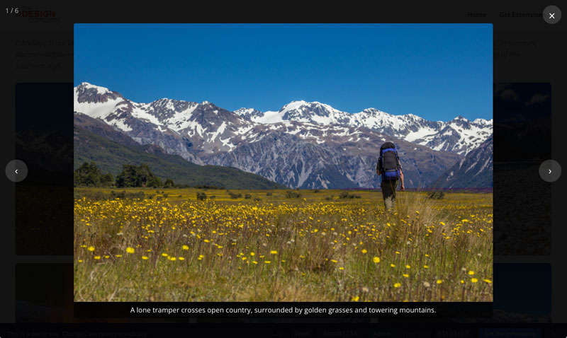
Lightbox
When a visitor clicks an image in the gallery grid, it opens in a full-screen lightbox.
Navigation
- Arrow keys or the Previous/Next buttons — move between images.
- Escape or the Close button — close the lightbox.
- Touch swipe (left/right) — navigate on mobile.
Captions
If an image has a caption and Show Captions in Lightbox is enabled in the component options, the caption is displayed directly below the image.
Disabling the Lightbox
Set Enable Lightbox to No in the component options to disable it globally. Images will display without a click interaction.
Image Links
Individual images can be given an external link URL. When set, clicking the image opens the URL in a new tab instead of the lightbox. Useful for linking to product pages, portfolios, or related content.
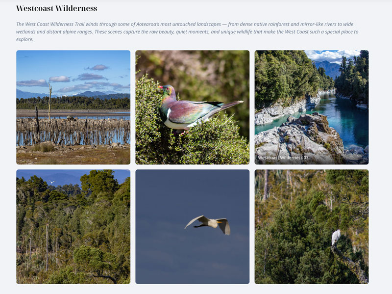
Gallery Listing
The Galleries menu item type displays all published galleries as a card grid. Each card shows the cover image, gallery title, description, and image count. Clicking a card takes the visitor to that gallery’s grid view.
Shortcode Embedding
GalleryLab includes a content plugin that lets you embed galleries in articles and custom HTML modules.
Setup
- Go to System > Plugins and ensure the GalleryLab content plugin is enabled (it is enabled by default on install).
- In any article, add the shortcode where you want the gallery to appear:
{gallerylab 1}
Replace 1 with the ID of the gallery you want to display. Gallery IDs are shown in the Components > GalleryLab > Galleries list.
To show only the gallery images without the gallery heading, add title=0:
{gallerylab 1 title=0}
Usage Tips
- The shortcode renders the same grid and lightbox as the component views, with all style options applied.
- The optional
title=0setting hides the gallery heading in that shortcode instance. - You can embed multiple galleries on the same page using different IDs.
- Add introductory text or other content around the shortcode — it renders inline within the article.
Image Management
Ordering
Images within a gallery can be reordered using drag and drop in the admin image list. Changes save automatically, and the frontend grid reflects the saved order.
Alt Text
Every image should have alt text for accessibility and SEO. If no alt text is set, the image title is used as a fallback.
Publishing
Individual images can be unpublished to hide them from the frontend without deleting them.
Component Options
Configure global defaults in Components > GalleryLab > Options.
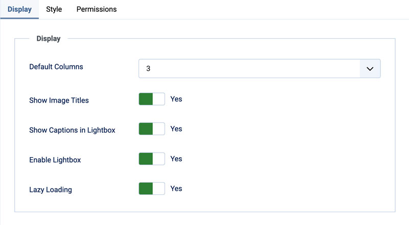
Display Settings
- Default Columns — number of columns for the grid (2–6). Individual galleries can override this.
- Show Image Titles — show the image title in a hover overlay. Default: Yes.
- Show Captions in Lightbox — show image captions below the image in the lightbox. Default: Yes.
- Enable Lightbox — enable or disable the lightbox globally. Default: Yes.
- Lazy Loading — enable native browser lazy loading on gallery images. Default: Yes.
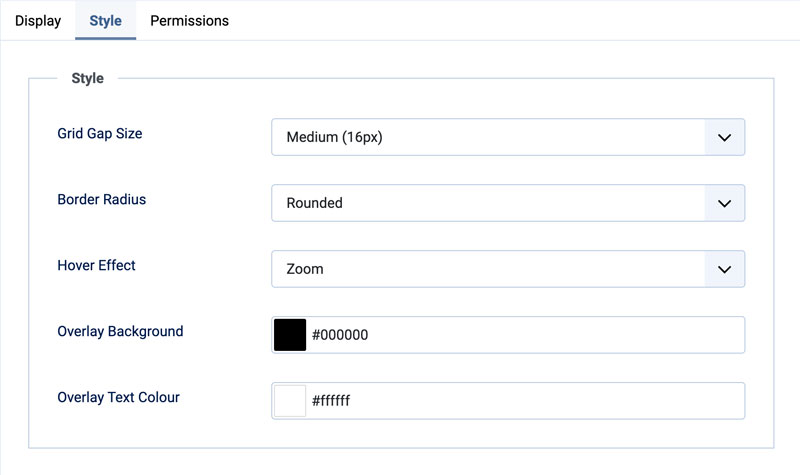
Style Settings
- Grid Gap Size — spacing between images: Small (8px), Medium (16px), or Large (24px).
- Overlay Background — background colour of the image title overlay. Default: black.
- Overlay Text Colour — text colour of the image title overlay. Default: white.
- Border Radius — Square, Rounded (default), or Circle.
- Hover Effect — None, Zoom (default), or Fade.
Support
For help, feature requests, or bug reports, visit the GalleryLab page on the TDCLab extensions site: extensions.thedesigncompany.co.nz
Licence
GalleryLab is free software released under the GNU General Public License v2 or later.