TDC Lab Launcher — Documentation
Customisable shortcut cards for the Joomla administrator dashboard.
TDCLab Launcher is an administrator module for Joomla 5 and 6 that displays a grid of shortcut cards linking to components, views, or external URLs. Build a personalised admin dashboard with grouped, colour-coded shortcuts that help you and your clients get to the right place fast.
Requirements
- Joomla 5.x or 6.x
- PHP 8.1+
Installation
- Download the latest release from extensions.thedesigncompany.co.nz.
- In your Joomla administrator, go to System > Install > Extensions.
- Upload the
mod_tdclab_launcher-v*.zippackage and click Upload & Install. - Navigate to Content > Administrator Modules and find TDCLab Launcher in the list.
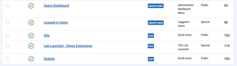
- Assign the module to a position (e.g.
cpanel) and configure as needed.
Module Options
The Module Options tab controls the overall layout and behaviour of the card grid.
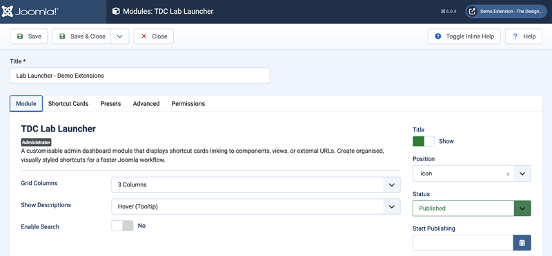
Grid Columns
Sets the number of columns in the card grid. Choose from 2, 3 (default), 4, or 6 columns. The grid automatically collapses to 2 columns on tablets and 1 column on mobile.
Show Descriptions
Controls how card descriptions are displayed:
- Hover (Tooltip) (default) — Descriptions appear as a browser tooltip when hovering over a card.
- Inline — Descriptions are displayed beneath the card title as smaller grey text.
- None — Descriptions are hidden entirely.
Enable Search
When enabled, a search box appears above the card grid. Typing in the search box filters cards in real time by title or group name. Cards that don't match are hidden, and empty group headings are automatically removed.
Module Title
The module uses Joomla's standard Title field and Show Title toggle (on the Module tab) to display a heading above the cards. Set the title to something like “Dashboard” or “Quick Links” and toggle Show Title to Yes to display it.
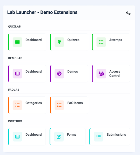
Shortcut Cards
The Shortcut Cards tab is where you define your cards. Each card is shown as a compact collapsible row so larger launcher setups remain manageable. You can add, remove, move, expand, collapse, filter, and reorder cards without scrolling through every field at once.
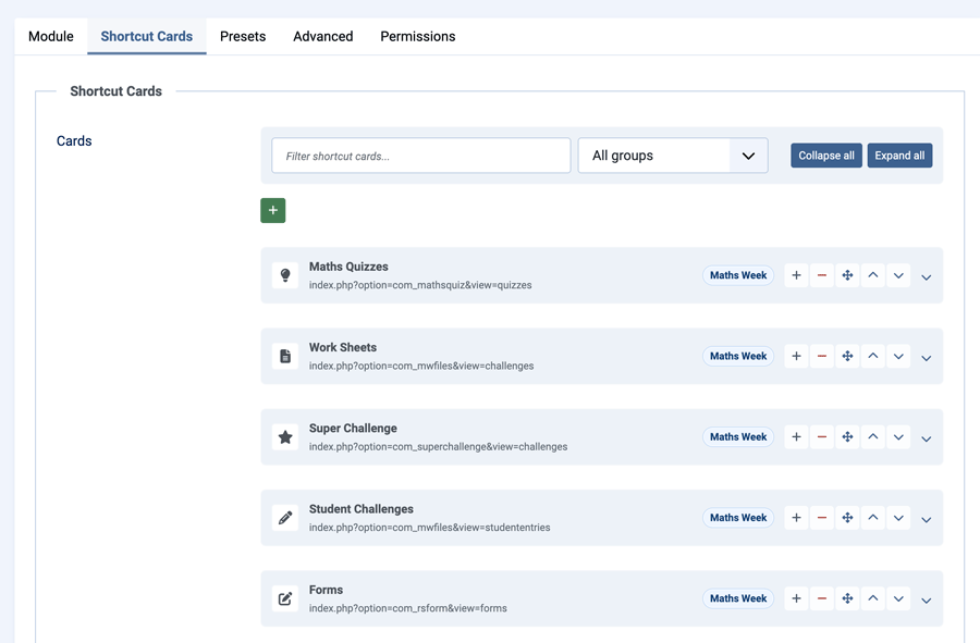
Managing Cards
Each collapsed row shows the card icon, title, link, group, and available row actions. Click the row, the chevron, or use the keyboard to expand the card and edit its fields.
Use the toolbar above the cards to:
- Filter shortcut cards by title, group, link, icon, description, or badge
- Filter by group using the group dropdown
- Collapse all cards for quick scanning
- Expand all cards when making broader edits
Group names entered on existing cards are also offered as suggestions when editing another card's Group field. This helps keep group names consistent and avoids accidental variants such as "Content", "content", and "Contents".
The main fields remain visible when a card is expanded:
- Group
- Title
- Link
- Icon
Less frequently used fields are grouped under Advanced fields:
- Description
- Badge
- Badge Style
- Accent Colour
- Open In
- Visible To
Card Fields
Each card has the following fields:
Group
An optional section heading. Cards with the same group name are displayed together under a shared heading. Leave blank for ungrouped cards.
For example, giving three cards the group "Content" and two cards the group "Users & Access" will render them in separate sections with those headings.
Title
The card's heading text. This is the main label displayed on the card and is required.
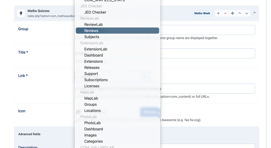
Link
The URL the card links to. You can either:
- Select from the dropdown -- Choose any installed component and its submenu items directly from a dropdown. The dropdown lists all admin menu items grouped by component.
- Enter a custom URL -- Select "Custom URL" from the dropdown and type a relative admin URL (e.g. index.php?option=com_content&view=articles) or a full external URL (e.g. https://example.com).
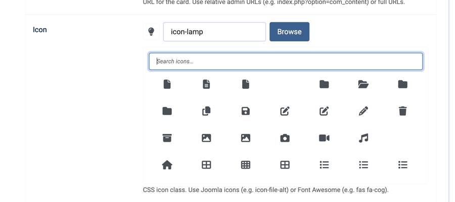
Icon
The icon displayed on the card. Click Browse to open a visual icon picker showing all available Joomla admin icons. Click an icon to select it, or use the search field to filter icons by name.
You can also type an icon class directly into the text field (e.g. icon-file-alt, icon-cog).
Description
Optional text providing more context about the card's purpose. How it's displayed depends on the Show Descriptions setting in Module Options (hover tooltip, inline text, or hidden).
Badge
Optional short text displayed as a coloured pill beside the card title. Useful for labels like "New", "Beta", or a version number.
Badge Style
The colour scheme for the badge:
- Info (blue)
- Success (green)
- Warning (yellow)
- Danger (red)
Accent Colour
An optional colour that adds a left border and tinted icon background to the card. Use the colour picker to choose, or leave blank for a plain card. Cards sharing a group often look best with the same accent colour.
Open In
Controls whether the link opens in the same window (default) or a new tab. Cards set to open in a new tab display a small external link icon beside the title.
Visible To
Restrict the card to specific user groups. Select one or more groups from the list. Only users belonging to at least one of the selected groups will see the card. Leave blank to show the card to all admin users.
This is useful for hiding advanced or sensitive shortcuts from content editors while keeping them visible to administrators.
Presets
The Presets tab provides ready-made sets of common Joomla shortcuts. Presets are merged with your custom cards — preset cards appear before any manually defined cards.
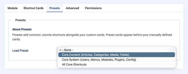
Available Presets
Core Content
Four cards linking to the most common content management areas:
| Card | Link | Icon | Accent |
|---|---|---|---|
| Articles | com_content > Articles | file-alt | Blue |
| Categories | com_categories | folder-open | Blue |
| Media Manager | com_media | images | Blue |
| Fields | com_fields | puzzle-piece | Blue |
Core System
Eight cards covering user management, site structure, and configuration:
| Card | Link | Icon | Accent |
|---|---|---|---|
| Users | com_users > Users | users | Green |
| User Groups | com_users > Groups | users-cog | Green |
| Menus | com_menus | list | Purple |
| Modules | com_modules | cube | Purple |
| Plugins | com_plugins | plug | Purple |
| Global Configuration | com_config | cog | Red |
| Templates | com_templates | paint-brush | Red |
| Languages | com_languages | comments | Red |
All Core Shortcuts
Combines both presets into a single set of 12 cards.
Tips and Examples
Client Dashboard
Create a focused dashboard for a client by adding only the cards they need:
- Articles, Categories, and Media under a “Content” group
- A link to their template style editor under “Appearance”
- An external link to their hosting control panel in a new tab
Set the module title to “Welcome” and toggle Show Title to Yes for a friendly greeting.
Multi-Role Setup
Use the Visible To field to create a single module instance that adapts to different users:
- Show all cards to Super Users and Administrators
- Restrict “Global Configuration” and “Plugins” to Administrators only
- Show only “Articles” and “Media Manager” to content Editors
Multiple Module Instances
You can create several instances of TDCLab Launcher and assign them to different admin positions or pages. For example:
- A “Quick Links” module in the main dashboard with general shortcuts
- A “Content Tools” module on a custom admin page with content-specific links
Using Badges
Badges are handy for flagging cards:
- “New” (info) on a recently installed component
- “Beta” (warning) on an extension still being tested
- “Urgent” (danger) on something that needs attention
Automatic Updates
TDCLab Launcher includes a built-in update server. When a new version is released, it will appear in System > Update > Extensions alongside your other Joomla updates. Click Update to install the latest version automatically.
Support
For questions, bug reports, or feature requests, visit extensions.thedesigncompany.co.nz or contact info@thedesigncompany.com.
Licence
GNU General Public License version 2 or later. See GNU GPL v2.